Colour Snapper
Let me tell you about one of my favourite tools.
It is merely and only a colour picker, equivalent to Photoshop’s eyedropper tool, except for the whole screen. One tiny edge of functionality in a universe of functions.
It is: Colour Snapper
These were the wise words of one of my esteemed colleagues, when told about it today:
Ow. $5.
You do realise OSX has the Digital Colour Meter right?
Yes, they are tools that do the same thing, and yet no.

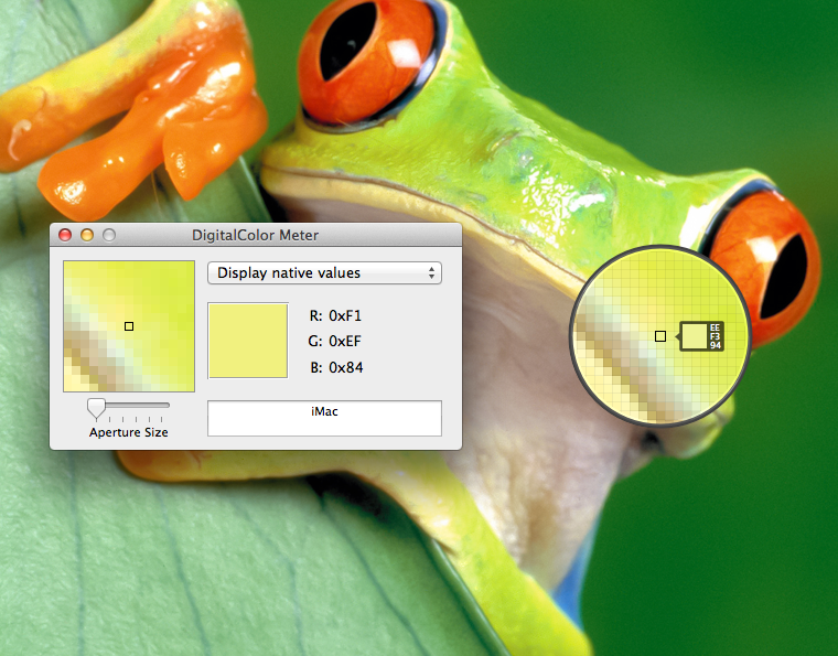
Digital colour meter on the left, Colour Snapper on the right.
- It just looks better.
- There is unbelievably less chrome to deal with.
- This reduces the cognitive overhead of all those buttons.
- It doesn’t cover up what you’re working on.
- Did I mention it looks so nice?
- That’s probably my circle obsession coming out again.
- It’s just a keyboard shortcut away (I keep mine on ⌘⇧2) just hanging out in the menu bar waiting to be invoked
- It reduces the common case to one keyboard shortcut and one click (copy the colour under the cursor to the clipboard in a predefined format)
- It has never once disobeyed me, or broken something I was doing or crashed or whatever and I love it for that.
- The loupe is flexible enough (⌘+, ⌘-) that I frequently invoke the colour picker just for the loupe and don’t pick a colour at all.
Whatever you do, as a design professional don’t fall victim to the taking screen shot, loading it into Photoshop, and then picking the colour there. Sadness and destruction are the only possible outcomes of that.
Honourable mention goes to my ⌘⇧1 tool: PixFit, also $5, a measuring tool that isn’t quite a screen ruler.